Apple’s big new design language is almost here, and it’s coming to all of Apple’s major operating systems in the fall with the official launch of iOS 26. Liquid Glass is what Apple calls its newest design philosophy, and it promises to bring major changes to how all of its operating systems look and feel. That includes iOS, its most important operating system.
Indeed, Liquid Glass does bring somewhat of a major change to iOS 26, or what we would have called iOS 18 (Apple is switching iOS numbers to years, and iOS 26 will release in the fall). I’ve been using the developer beta of iOS 26 for some weeks now, but now that the public iOS 26 beta is open, I can finally share my thoughts.
The short version? Liquid Glass may not bring quite as big of a shift to iOS as Apple might have you believe, but that’s probably not a bad thing. And while I’m focusing on Liquid Glass, there are a ton more iOS 26 features to check out.
As always, remember that the iOS 26 beta is… a beta. So, back up your phone before making the switch. And as Apple says in its Beta Program FAQ, “Beta software may contain errors or inaccuracies and may not function as well as commercially released software. We encourage you to submit feedback when you encounter these issues.
The basics of Liquid Glass on iOS 26
The idea of Apple Liquid Glass is simple. Instead of a flat, minimalistic approach to software design, Apple is embracing layers. Software interface elements have always been stacked on top of each other, whether you could see that or not. With Liquid Glass, those layers come into focus. You can see what’s behind things like buttons and controls, thanks to glass-like elements that are designed to look like real glass. These transparent touches also bend and refract light.
To be clear, this isn’t necessarily a totally new approach for Apple. The company has always played with transparency a little — but with Liquid Glass, transparency is more involved than ever.

Credit: Christian de Looper / Apple
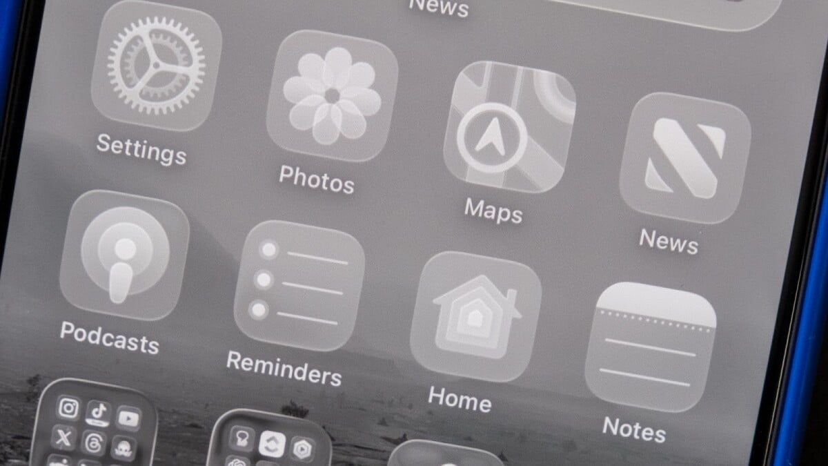
So, where do these glass-like elements show up? Well, pretty much everywhere. Most of Apple’s stock apps have had controls at the bottom of the screen. For example, in the Music app, you’ll get controls for searching, accessing your library, and controlling currently playing media. In the News app, you get controls for today’s news, sports news, and a search tool. With Liquid Glass, all of these controls are condensed into a pill-like shape that minimizes as you scroll to maximize what you can see on the screen.
The glass approach means that whether the controls are in full focus or minimized, what’s behind them kind of bends and refracts like it would if real glass was placed on top of the screen. It’s a cool, futuristic effect, and it certainly looks pretty natural in my initial testing.
There are other places that Liquid Glass shows up too. Perhaps the best example is the Control Center, which now shows your home screen behind all of the controls when you swipe down. This is true on all of Apple’s operating systems — though of course, the controls are different on iOS than they are on MacOS (and now MacOS Tahoe).
Mashable Light Speed

Credit: Christian de Looper / Apple
When the iOS 26 developer betas first started rolling out, not everyone liked the Liquid Glass-ified Control Center. There were issues with being able to see controls on the screen, depending on what was behind them. Apple fixed a lot of those issues ahead of the public iOS 26 beta, and it’s now easier to see what’s on the screen. Still, there are other places where I found some display issues. An example are app and app folder labels — if you have a particularly bright and busy wallpaper, these labels can get a little hard to read.
Fortunately, a big theme with iOS 26 is personalization, so if you want to reduce the transparency even more than Apple already has, you can do so in the Accessibility section of the Settings app.
Honestly, I quite like the visual aspect of Liquid Glass. I like the idea of returning to a more skeuomorphic design approach, and that doesn’t necessarily mean that Apple should make the Notes app look like a notepad. It can instead mean that objects on the screen look like some kind of physical object, whether it be glass or something else. And Apple has done a good job at making Liquid Glass feel smooth and futuristic for this beta. It really does translate pretty well when you’re scrolling.
A streamlined interface
The new aesthetic is about more than transparency. The approach is based around showing as much on the screen as you possibly can, and sometimes that means taking away controls, or at least streamlining them when they’re not being used.

Credit: Christian de Looper / Apple
As you’re scrolling, many of the controls in apps like News, Messages, and Music minimize into one icon that you can tap. I almost never have to actually tap on these icons, so I really don’t mind that they’re now tucked away.
I felt the streamlining went too far in other places. In the Camera app, for example, when you first open the app, you’ll now only have two options: photo or video. In reality, there are other options that you can swipe through, they’re just hidden by default. It is true that most users probably don’t swipe between all these different modes anyway, and simply having photo and video modes makes things a lot simpler. But if you do use those extra modes, you’ll have to remember that they’re still available to you, and without any visual cues, you might forget.

Credit: Christian de Looper / Apple
I’m also hoping Apple keeps tweaking the appearance of the Messages app. Instead of a header with your contact’s profile picture and name, the back button, and the FaceTime button, there are floating bubbles at the top of the screen. Depending on what’s behind those floating bubbles, you’ll either see straight through to the messages behind, or the interface will kind of fade so that you can see the controls.
This might be a me problem, but as a journalist, I take a lot of screenshots. Apple, if you’re listening, I don’t like the extra clicks it takes to save a screenshot.

Credit: Christian de Looper / Apple
You can customize Liquid Glass
If you ever feel like there’s too much glass in your Liquid Glass, you can change that. In addition to reducing the transparency, you can also customize app icons. And while the ultra-clear look got a lot of attention after WWDC, you don’t have to use Liquid Glass icons, and they’re not enabled by default. I think that’s a smart approach. Change is scary, and this makes it easier on users who aren’t ready for the ultra clear, full Liquid Glass experience.

Credit: Christian de Looper / Apple
I think Liquid Glass is an interesting design evolution for Apple, and as mentioned, I like the idea of Apple moving towards software design that looks like real-life physical objects again. For now, you have to go into the Accessibility menu to tweak the visuals to your liking, but I expect Apple will iron out a lot of issues before the official iOS 26 launch. That’s the whole point of a beta, after all.
If you’re interested in trying Liquid Glass for yourself on iOS, macOS Tahoe, iPadOS, tvOS, or watchOS, you can sign up for the Apple Beta program.